
Send to a friend
The details you provide on this page will not be used to send unsolicited email, and will not be sold to a 3rd party. See privacy policy.
This article was supported by The Rockefeller Foundation Bellagio Center.
The project wants a clearer picture and open talk on poverty. Does it oversimplify? Tania Rabesandratana investigates.
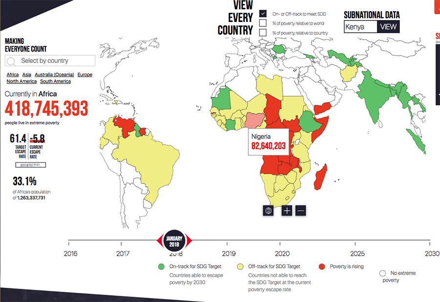
Every minute in Nigeria, 6.5 people fall into extreme poverty. And as this sentence is being written, 42.5 per cent of its population — 82,640,203 people — are extremely poor.
These are up-to-the-second, specific estimates that come from the World Poverty Clock: a database, launched in May 2017, of national income figures paired with easy to follow, real-time graphics. Nigeria’s rising poverty trend translates to the colour red on the website's map.
Official data sources do not give such specific poverty estimates. The 'global poverty today' figure often bandied at big international meetings is usually based on four-year-old data, says Homi Kharas, the lead economic adviser behind the clock, who also leads the global economy and development programme at the Brookings Institution, a US think tank.
This is exactly the mind-set we are trying to break. We want everyone to talk about poverty dynamics.
Homi Kharas
The clock’s team is aiming to paint a clearer and more timely picture, so that countries can check their progress to escaping extreme poverty by 2030 — one of the targets under the UN's global Sustainable Development Goals (SDGs).
In the process, the clock can also come up with surprises.
The clock is the brainchild of the non-profit arm of World Data Lab (WDL), an Austria-based company. Its models rely primarily on publicly available national household surveys, which governments typically conduct every three to ten years, to project income figures into the present and the future.
For India, for example, the estimates are based on 2012 data collected by the National Sample Survey Office, adjusted and published by the World Bank on its PovcalNet website. Though the clock's algorithms rely largely on World Bank data, the bank is not responsible for the clock.
Those algorithms estimate how people's incomes change over time in each country, using economic growth forecasts and long-term scenarios that account for global events such as climate change.
The estimates, available for all nations except Syria, are then paired with graphics to display how fast each country is escaping poverty and whether they will meet the 2030 goal. “We want this used by individual countries, to see how they are doing against their neighbours,” says Kharas.
Other observers have embraced the clock's approach. For example, the SDG Index and Dashboards Report issued to monitor progress towards the targets uses the clock's data in its 2017 edition.
The clock could be more accurate if private or philanthropic data was added, says Ndemo. For example, Kenyan mobile operator Safaricom “has some of the best data” from users and from its M-Pesa money transfer service, but is reluctant to share them, he deplores.
It sounds like science fiction but is actually doable when you sit down with people who know their stuff
Jesús Crespo Cuaresma
From November 5 – December 3, 2018, the Bellagio Center will host a special thematic residency on Science for Development, with a cohort of up to 15 scholars, practitioners, and artists whose work is advancing, informing, communicating, or is inspired by the use or design of science and technology to address social and environmental challenges around the world.