By: Ione Bingley
Send to a friend
The details you provide on this page will not be used to send unsolicited email, and will not be sold to a 3rd party. See privacy policy.
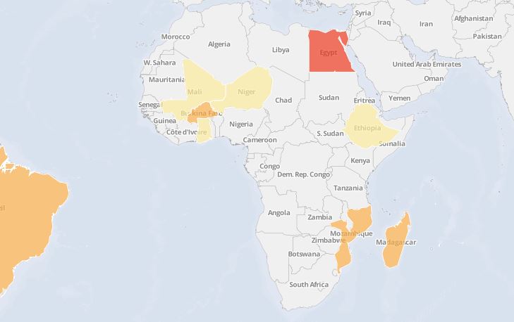
 Click to enlarge.
As part of our new series on PhDs and development in Sub-Saharan Africa, SciDev.Net is collating data over a range of issues – from postgraduate enrolment and gender equality to the links between PhDs and economic growth. We aim to gather and visualise the statistics underpinning stories about doctoral investment and growth on the continent.
In the first of our infographics we show how many people were enrolled to do PhDs in different African — and other — countries as a proportion of their overall population in the years 1999, 2005 and 2011.
The goal is to provide a historic view of PhD enrolment on the continent, allowing data to be compared for different countries at different points in time.
In putting together this interactive map, our initial aim was to gather data on PhD enrolment and graduation for each African country over 15 years.
-
The only African data openly available were on PhD enrolment. We were unable to gather data for PhD graduation.
-
In 2005, Tunisia reported the highest number of PhD enrolments across all years and countries, with 2,273 enrolments for every million citizens.
-
Ethiopia was one of the few African nations to provide numbers across the years. Its enrolment numbers rose steadily, but remain low with 0.3 enrolments for every million people in 1999, 0.6 in 2005 and nearly nine in 2011.
Key facts
But we quickly discovered a major obstacle: the data are often unavailable. On contacting organisations across Africa and the wider world, our requests for data were met with similar responses, ranging from “we have some data but most is missing” to “we would love that data but unfortunately no one has gathered it”. It became apparent that, in this case, the story was often about the dearth of data rather than the data sets themselves.
Eventually, the UNESCO (UN Educational, Scientific and Cultural Organization) Institute for Statistics got in touch to say that it had data for PhD numbers in some countries, but that most was missing.
Furthermore, data did not exist for each year: a country might provide data for a couple of years and then stop.
Finally, for those countries that had provided data, the numbers only related to enrolment rather than graduation.
This is obviously problematic, as the drop-out rate between PhD enrolment and graduation tends to be high not just within Africa but globally.
The map links enrolment numbers with population data from the World Bank.
Over the next 12 months, we will be pushing beyond this initial data exploration to gather statistics from governments, universities and research institutes — thus helping to build a fuller picture of Africa’s PhD investment and growth
> ![]()
![]()
![]()


