By: Joshua Howgego
Send to a friend
The details you provide on this page will not be used to send unsolicited email, and will not be sold to a 3rd party. See privacy policy.
[LONDON] Three ‘evidence gap maps’ that aim to show which types of development interventions have been robustly evaluated received a cautious welcome at a launch event last week.
The International Initiative for Impact Evaluation (3ie) says its maps are a response to the “information overload” caused by a surge in evaluation of development programmes in recent years. They are designed to quickly get across what is and is not known about a given topic, and only include robust evidence: impact evaluations and systematic reviews.
At a launch event last week (5 February) at the London School of Hygiene & Tropical Medicine, United Kingdom, 3ie published gap maps on: education; water, sanitation and hygiene; and interventions called productive safety nets, which aim to give people the means to make a living.
“I think the real value is not in the first look, but when you drill down into the detail.”
Nina Marshall, Economic and Social Research Council
Methods for systematically scoping out the evidence on particular development interventions have been around since at least 2009.
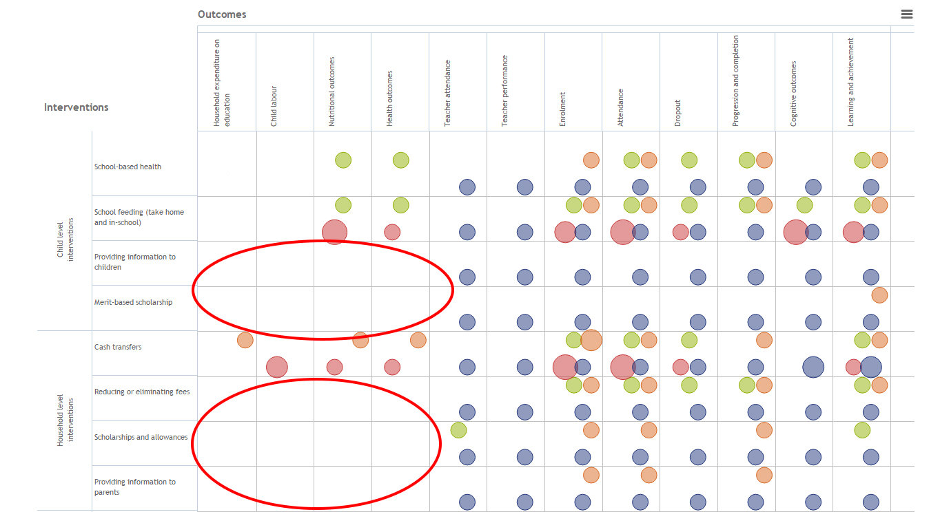
But 3ie, an NGO that works to promote evidence-based policy in developing nations, says its maps are the first to present this information in a simple table, with interventions listed vertically and the various areas of outcome that studies have assessed listed horizontally.
This means the maps show at a glance which interventions have been tested and what metrics were used to evaluate the result. For example, the map below, which looks at education interventions, shows that, when testing the impacts of merit-based scholarships, researchers have looked at school attendance and cognitive outcomes — but not health effects or whether the scholarships reduce child labour. A colour coding system also aims to show how robust 3ie deems each study to be.
It is easy to feel you are “drowning in information” when it comes to evaluations of development interventions, said Birte Snilstveit, an evaluation specialist at 3ie who codeveloped the maps, at the launch event.
She said the maps should help those commissioning research avoid unnecessarily duplicating findings, and help policymakers see what interventions are backed by evidence.
A ‘messy picture’
But three representatives from the development community who spoke at the launch warned that the gaps should not be taken at face value.
Ellie Ott, humanitarian evidence programme and communications manager at Oxfam, noted that, because the maps exclude all but the most robust evidence, the gaps may give the impression that nothing is known about an issue, when in some cases indigenous knowledge or internal NGO research may exist.
She implied that the maps’ attractive simplicity may be a weakness, as it hides unavoidable, real-world complexity.
Laura Koch from the Evidence into Action team within the United Kingdom’s Department for International Development said the research behind development interventions is actually “a very messy picture”.

She said: “When you see the map on the screen, it seems obvious that you should try to fill the gaps. But it’s not that simple.” Koch added that if DFID were deciding which of several projects to continue funding it would, for example, also have to listen to insights from its country officers who are seeing the effects of various programmes on the ground.
Nina Marshall, deputy head of the UK Economic and Social Research Council’s international development research team, said: “I think the real value [of the gap maps] is not in the first look, but when you drill down into the detail.”
To do this users can click on individual evaluations and get a summary of the findings and information about any shortcomings the 3ie team saw. For example, Martina Vojtkova, an evaluation specialist at 3ie who jointly developed the maps, noted that many studies do not define the economic status of the subjects involved — they were often simply listed as “poor”.
Vojtkova and Snilstveit agreed it was essential to go deeper than the maps’ topline picture to fully understand the research. Because of that, “I don’t think the audience for this is the minister, it’s more the policy analyst”, said Vojtkova.
Snilstveit said she was at pains not to oversell the tool, calling it “a new brick in the evidence architecture”.
3ie plans to release seven more gap maps in the coming months.
> Link to the education gap map
> Link to the water, sanitation and hygiene gap map
> Link to the productive safety nets gap map
This is part of a set of pieces on data funded by the Hewlett Foundation.
More on Data