By: Andrew Pleasant
Send to a friend
The details you provide on this page will not be used to send unsolicited email, and will not be sold to a 3rd party. See privacy policy.
- Translating the evidence
- Individual versus population risk
- Absolute and relative risk
- The dangers of comparing risk
- In summary
Translating statistics and risk in a readily understandable way is crucial to effective science communication, says Andrew Pleasant.
There has been concern about how journalists present statistics and risk for more years than anyone reading this has been alive. Academics, journalists, and many organisations have produced numerous books, training courses and presentations on the issue.
Yet journalists, and scientists, often present risk and probabilities in ways that cloud the intended message.
To get your audience’s attention, and more importantly their trust, you must clearly and accurately communicate scientific findings and their relevance. That often means material from a scientific article must be translated into something widely understandable.
Translating the evidence
The abstract of a scientific article should summarise the most important evidence, but that is not always the case. It’s best to read the entire article, looking for the claims that will most interest your audience.
Remember that while journalists put large claims and important facts (‘news’) at the very beginning of an article, scientific articles place the methodology, cautions and supporting evidence first. Supporting evidence in scientific articles can be quantitative (numerical), qualitative, or a mix of both. This article discusses quantitative evidence.
In general, translate quantitative data into the closest equivalent in everyday speech and place the specific findings in parentheses. For example, people usually say half, not 50 per cent. So you should write ‘about half (51.2 per cent)’ or ‘one-third (33 per cent)’.
Unless it is an exact match, like one-third and 33 per cent, I recommend always including the specific statistic. You should also try to include the margin of error (often called the confidence interval) because it indicates the reliability of the evidence.
Scientific articles often report percentages, for example "20 per cent of a sample of 215 people", or simply report 20 per cent in a table or chart. You should do the calculation for your readers and report: "43 of the 215 people sampled (20 per cent)". This accommodates multiple ways of understanding the evidence, making it easily accessible to more people.
Take away message: Your readers are not the primary audience for a scientific journal article, so you need to translate. You are responsible for accurately and clearly making the conclusions and supporting evidence fully understandable to people, using their existing literacy and numeracy skills.
Individual versus population risk
An oft-reported estimate is the lifetime breast cancer rate among women. This rate varies around the world from roughly three per cent to over 14 per cent.
In the United States, 12.7 per cent of women will develop breast cancer at some point in their lives. This statistic is often reported as, "one in eight women will get breast cancer". But many readers will not understand their actual risk from this. For example, over 80 per cent of American women mistakenly believe that one in eight women will be diagnosed with breast cancer each year.
Using the statistic ‘one in eight’ makes a strong headline but can dramatically misrepresent individual breast cancer risk.
Throughout her life, a woman’s actual risk of breast cancer varies for many reasons, and is rarely ever actually one in eight. For instance, in the United States 0.43 per cent of women aged 30–39 (1 in 233) are diagnosed with breast cancer. In women aged 60–69, the rate is 3.65 per cent (1 in 27).
Journalists may report only the aggregate lifetime risk of one in eight because they are short of space. But such reporting incorrectly assumes that readers are uninterested in, or can’t comprehend, the underlying statistics. It is critically important to find a way, through words or graphics, to report as complete a picture as possible.
Take away message: Be extra careful to ensure your readers understand that a general population estimate of risk, exposure or probability may not accurately describe individual situations. Also, provide the important information that explains variation in individual risk. This might include age, diet, literacy level, location, education level, income, race and ethnicity, and a host of other genetic and lifestyle factors.
Absolute and relative risk
You may also have to decide whether to report estimates of absolute or relative risk. Absolute risk is simply the probability of something happening (for instance, the one in eight figure used above). Relative risk is the comparison between risk in two different situations.
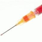
Journalists must help their audience understand the effect interventions such as vaccine have on the risk of a disease
Flickr/Nick Atkins Photography
For example, imagine a study that reports on a new vaccine to prevent dengue fever. The fictitious study gives two matched groups of 1000 Brazilians either a vaccine or a placebo. After five years, one vaccinated person is diagnosed with dengue, compared to four people who only received the placebo.
The absolute risk of getting dengue after the new vaccine is 0.1 per cent, and is 0.4 per cent after the placebo. Headlines could accurately read, "New vaccine lowers risk of dengue by 0.3 per cent." Not much of a headline!
But the relative risks present a very different picture. The new vaccine cuts the relative risk as compared to the placebo by 75 per cent. Headlines could also accurately read "New vaccine lowers risk of dengue by 75 per cent", which will certainly grab the attention of Brazilian readers.
Yet such a difference may actually be quite small, depending on how common the disease is. If a disease only affects four in a million people, cutting its risk by three quarters (a 75 per cent reduction) saves only three people in every million. Beyond the headline, you should present a thorough and balanced analysis of the risks and benefits.
Take away message: Choosing whether to use absolute or relative risk can make the same risk appear substantially different. Journalists must help their audiences understand this critically important distinction. Never assume your audience knows the difference between absolute and relative risk. Never assume they can accurately calculate or interpret the differences between the two methods. Best practice is to clearly and concisely communicate both, along with the implications of those differences.
The dangers of comparing risk


Journalists should avoid comparing risks with everyday activities such as driving
Flickr/smif
Commentators often try to communicate a new risk by comparing it to one their audience is already familiar with — but this can backfire.
For instance, in recent newspaper reports about the bacteria Escherichia coli in spinach products across the Canada and the United States, a government official was quoted as saying, "Like mad cow disease — another source of panic over agricultural products — the risk of illnesses from E. coli infection is really tiny. You’re taking a much bigger risk going out on the highway."
Such comparisons, no matter how well intended or whether expressed in a rich or poor nation, can fail for several reasons. In this example, government reassurances that compare the risk to ‘mad cow’ disease (Bovine Spongiform Encephalopathy or BSE) will backfire because it is well documented that the UK government, when faced with widespread BSE, failed to tell the truth about the risks from contaminated food.
Try not to compare unlike risks. For instance, the all-too-often-used comparison ‘you’re more likely to be hit by a bus / have a road accident than to…’ will generally fail to inform people about the risks they are facing because the situations being compared are so different. When people assess risks and make decisions, they usually consider how much control they have over the risk. Driving is a voluntary risk that people feel (correctly or not) that they can control. This is distinctly different from an invisible contamination of a food product or being bitten by a malaria-carrying mosquito.
Comparing the risk of a non-communicable disease, for example diabetes or heart disease, to a communicable disease like HIV/AIDS or leprosy, is similarly inappropriate. The mechanisms of the diseases are different, and the varying social and cultural views of each makes the comparison a risky communication strategy.
Take away message: Compare different risks sparingly and with great caution because you cannot control how your audiences will interpret your use of metaphor. This can be particularly true when multiple cultures are involved. Metaphors mean different things to different people. Consider the very famous phrase, ‘Love is like a red, red rose.’ What exactly is love to the reader? Is love the pleasing aroma, the beautifully intricate arrangement of the petals, the deep red color, or is love the sharp thorns?
In summary
To understand why people make different decisions about the same risk, you must understand their contexts. To successfully communicate science, you must start where your audience is — particularly in terms of language, numeracy skills and culture.
Know your audience and check back with them early and often. You can start doing this by asking colleagues, friends and family. Even better, occasionally gather a group of your audience and discuss how science is reported. You will learn what they like, dislike, understand and want to understand.
When you communicate risk, recognise the limits of your skills and ask for clarification, rather than blindly repeating a technical specialist. Do not be afraid to call the author of a journal article and ask for further explanation. Try to establish a good relationship with scholars you can ask for help.
Journalists — whether working in print, radio, television, or the Internet — can and should help further the spread of accurate knowledge. To do this, you have to get and keep an audience’s attention and trust.
To reach that goal, you must decipher complex science and clearly communicate that information. First, get the basics correct. Then, when relevant, add complexity in a way that both you and your readers can fully understand, evaluate and use. The result will be a more informed audience that relies on and trusts your work.
Andrew Pleasant is an assistant professor at Rutgers, the State University of New Jersey in the United States. He is co-author of the book ‘Advancing health literacy: A framework for understanding and action’.


